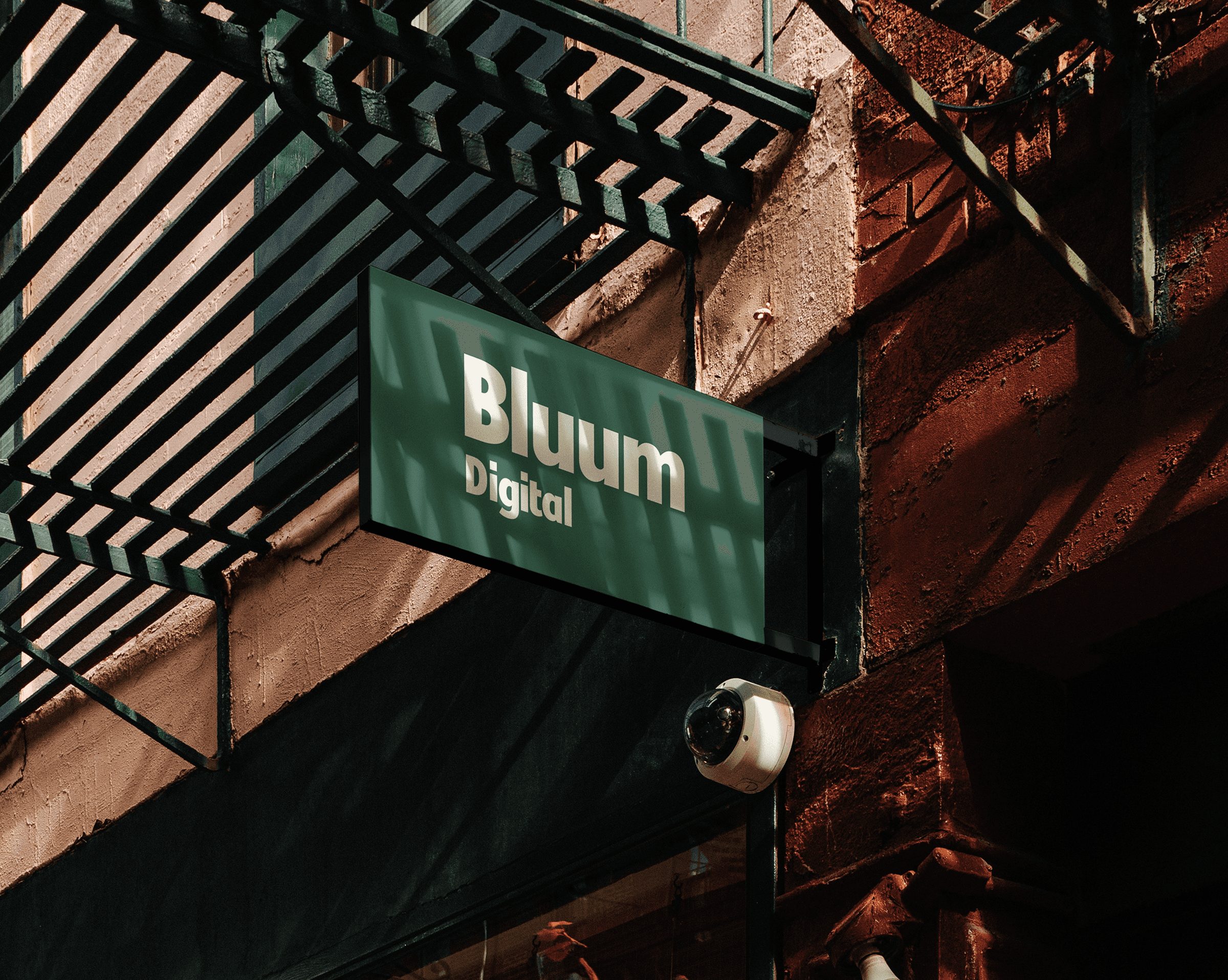
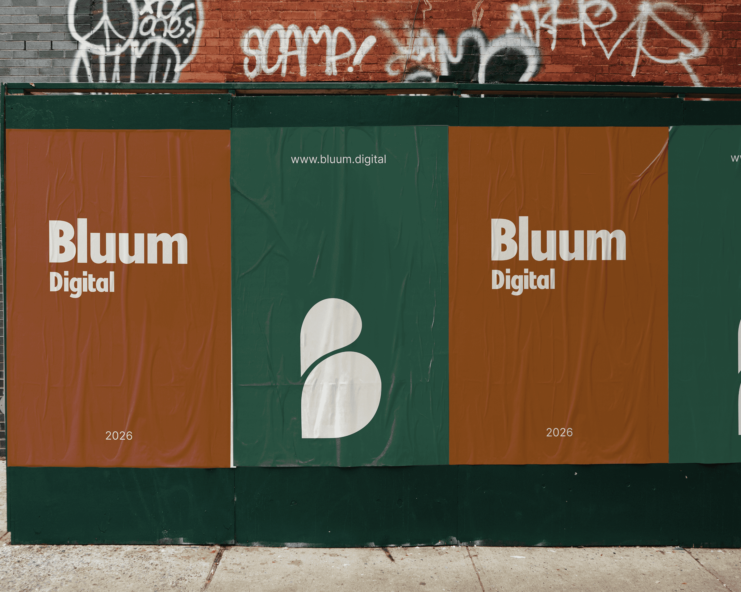
The main challenge was finding the balance between approachable and modern without leaning too far in either direction.
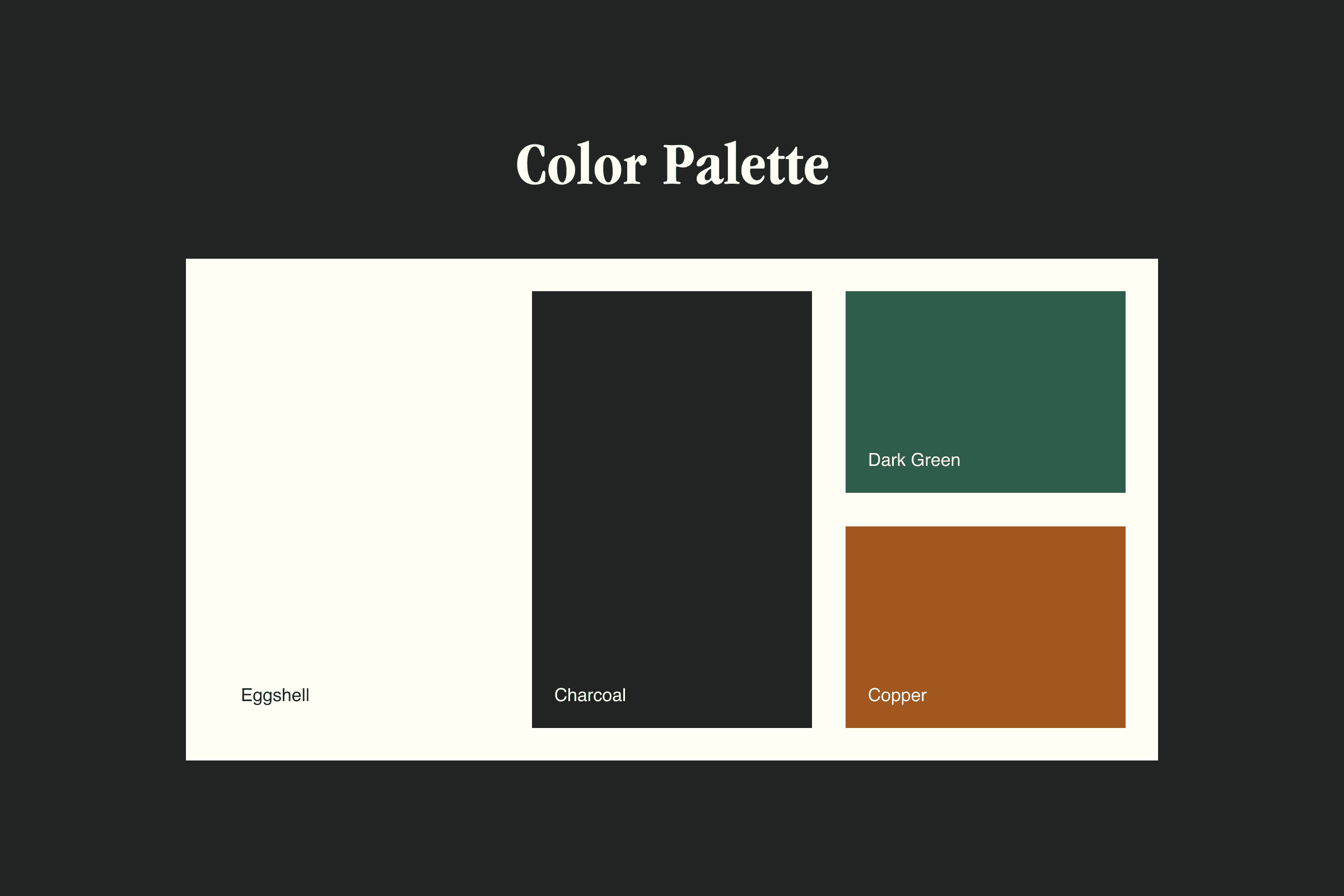
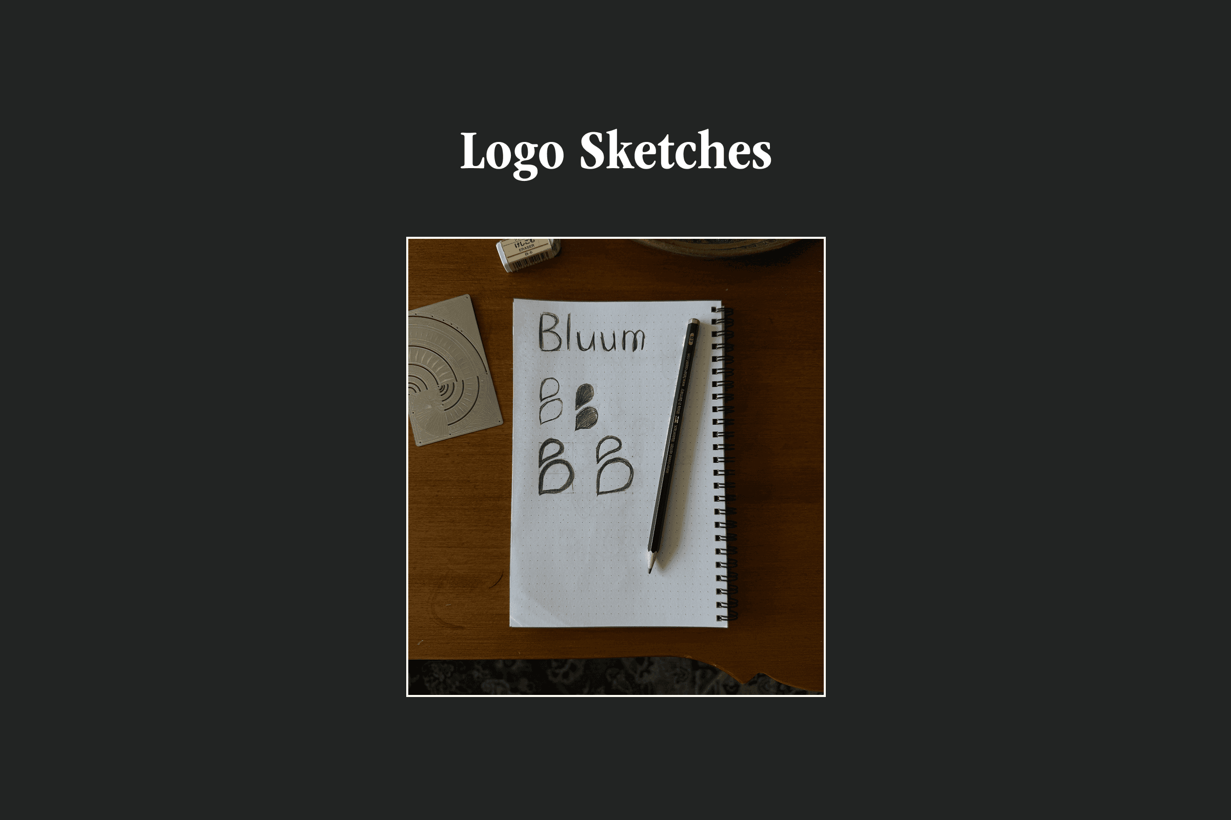
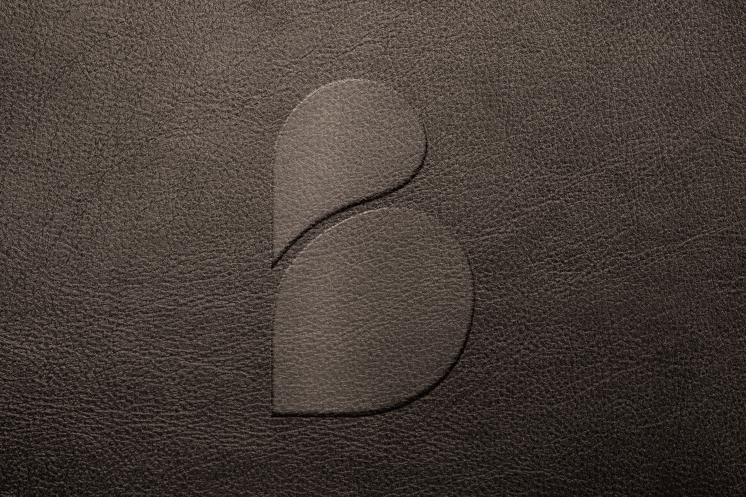
The color palette was built with Matt's audience in mind: rich green for early mornings spent outside, copper for the materials they work with, charcoal to ground it all, and eggshell to keep it feeling clean and current. The primary logo is clean and unassuming, echoing the confidence of the businesses Matt serves, while the leaf icon symbolizes a business that's blooming.
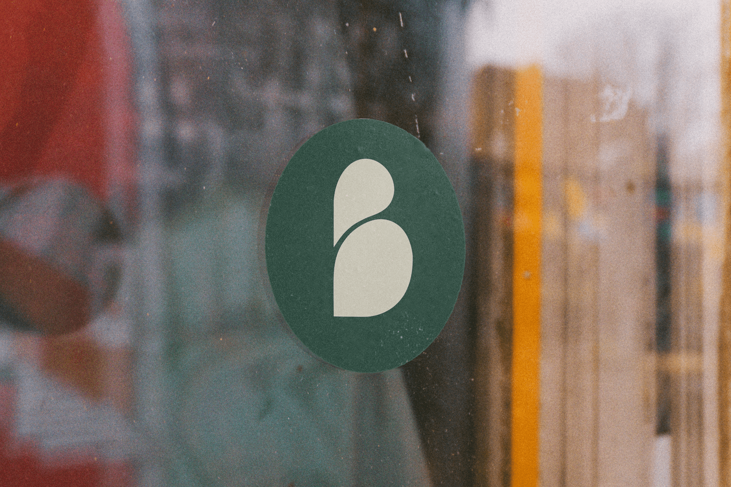
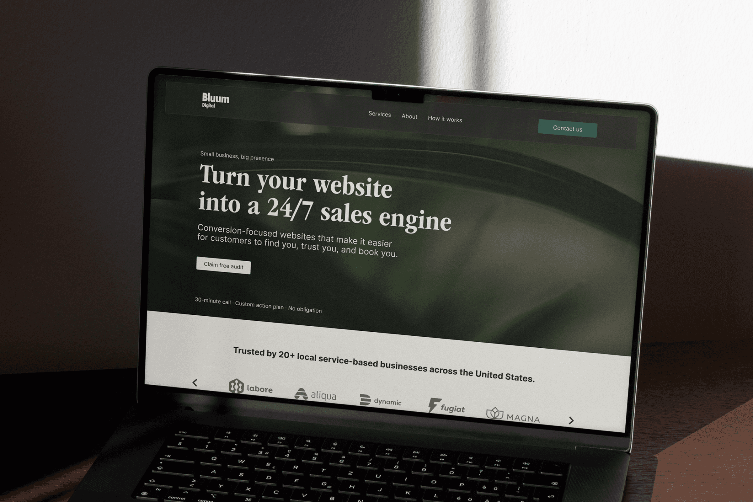
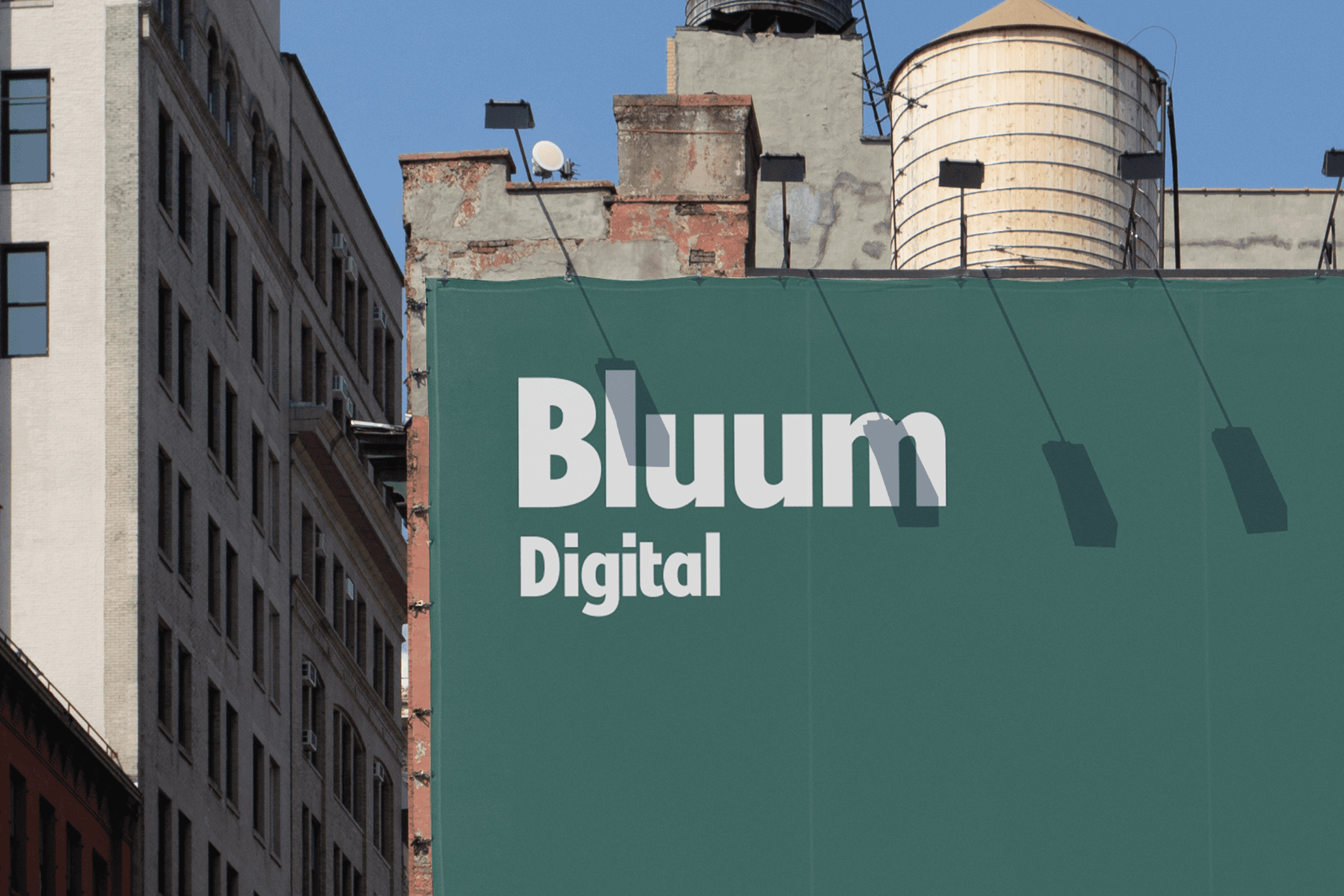
Bluum Digital now has a brand that bridges the gap between modern and approachable.
The new look is grounded enough for the plumber who has been in business for 30 years, yet modern enough for the founder who just launched last month. Matt can now show up to any client meeting with a brand that speaks their language.