
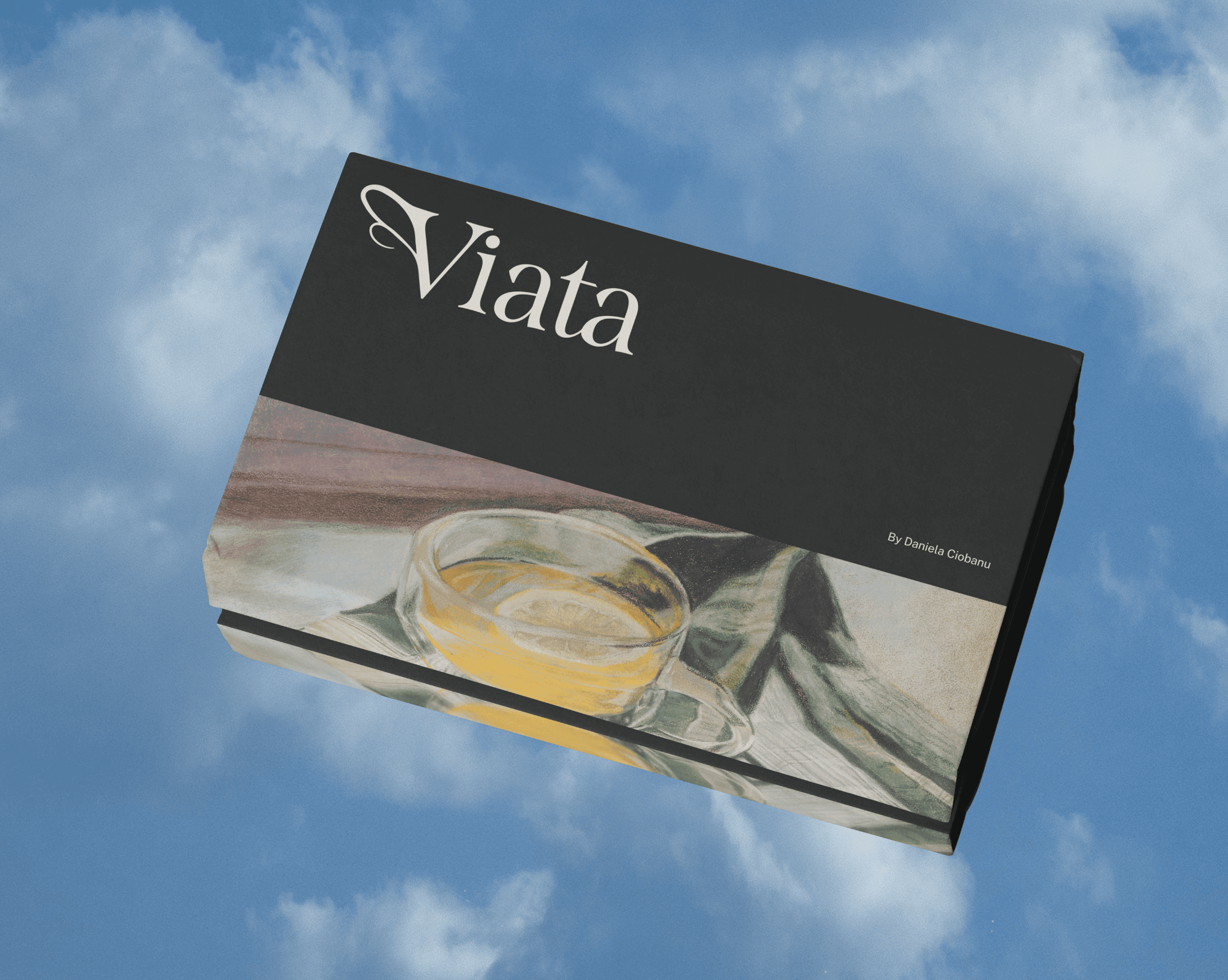
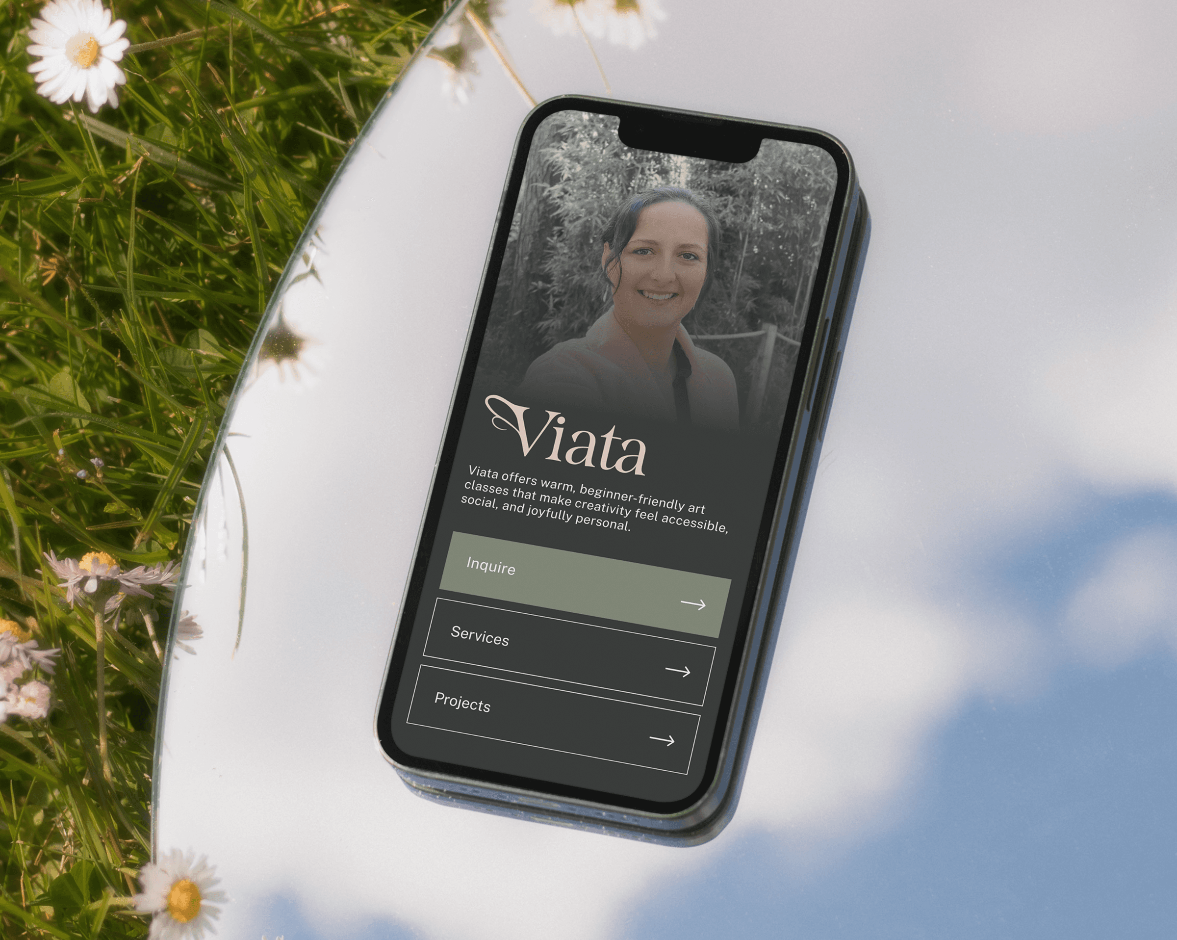
The main challenge was translating a feeling into a visual identity without being too literal.
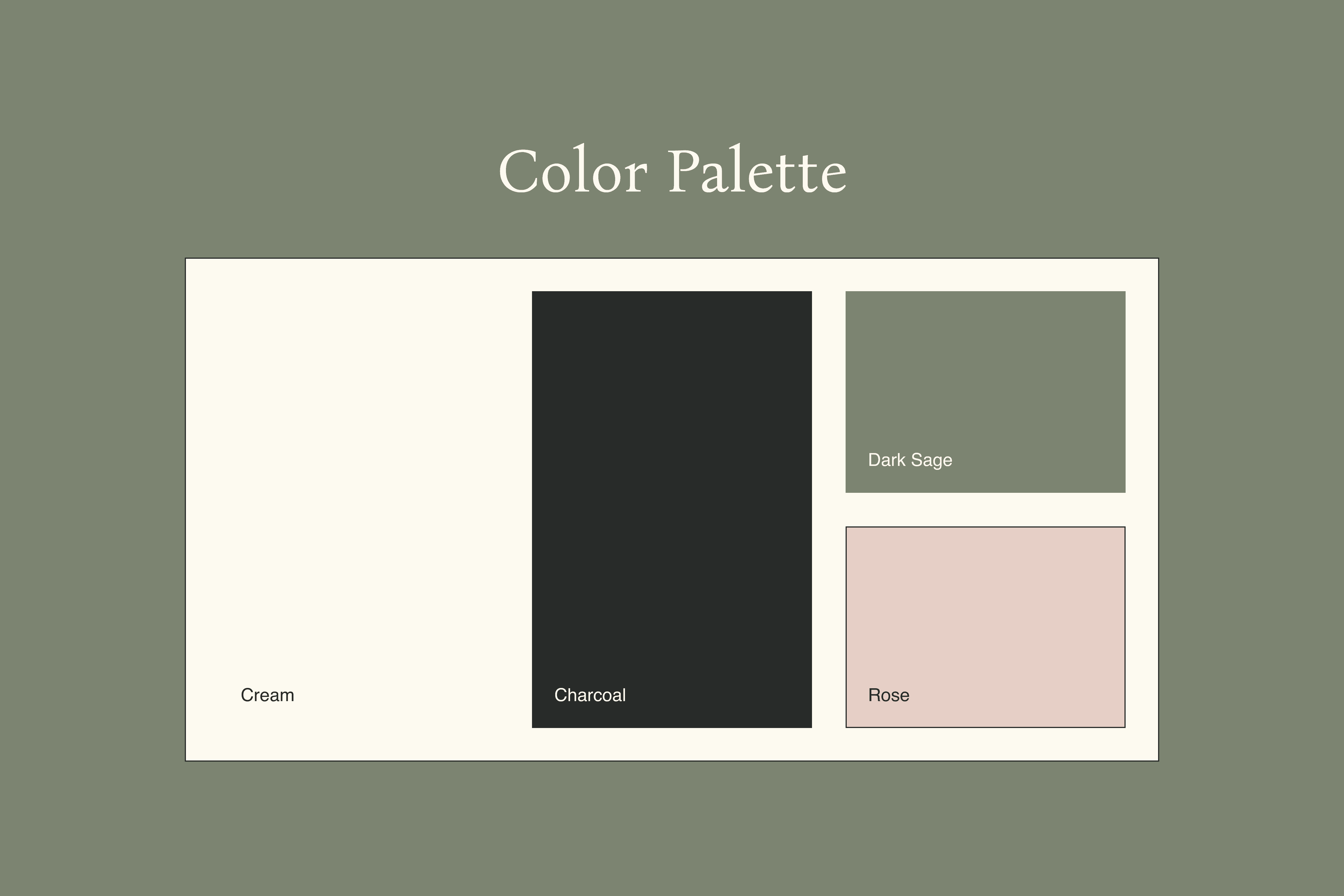
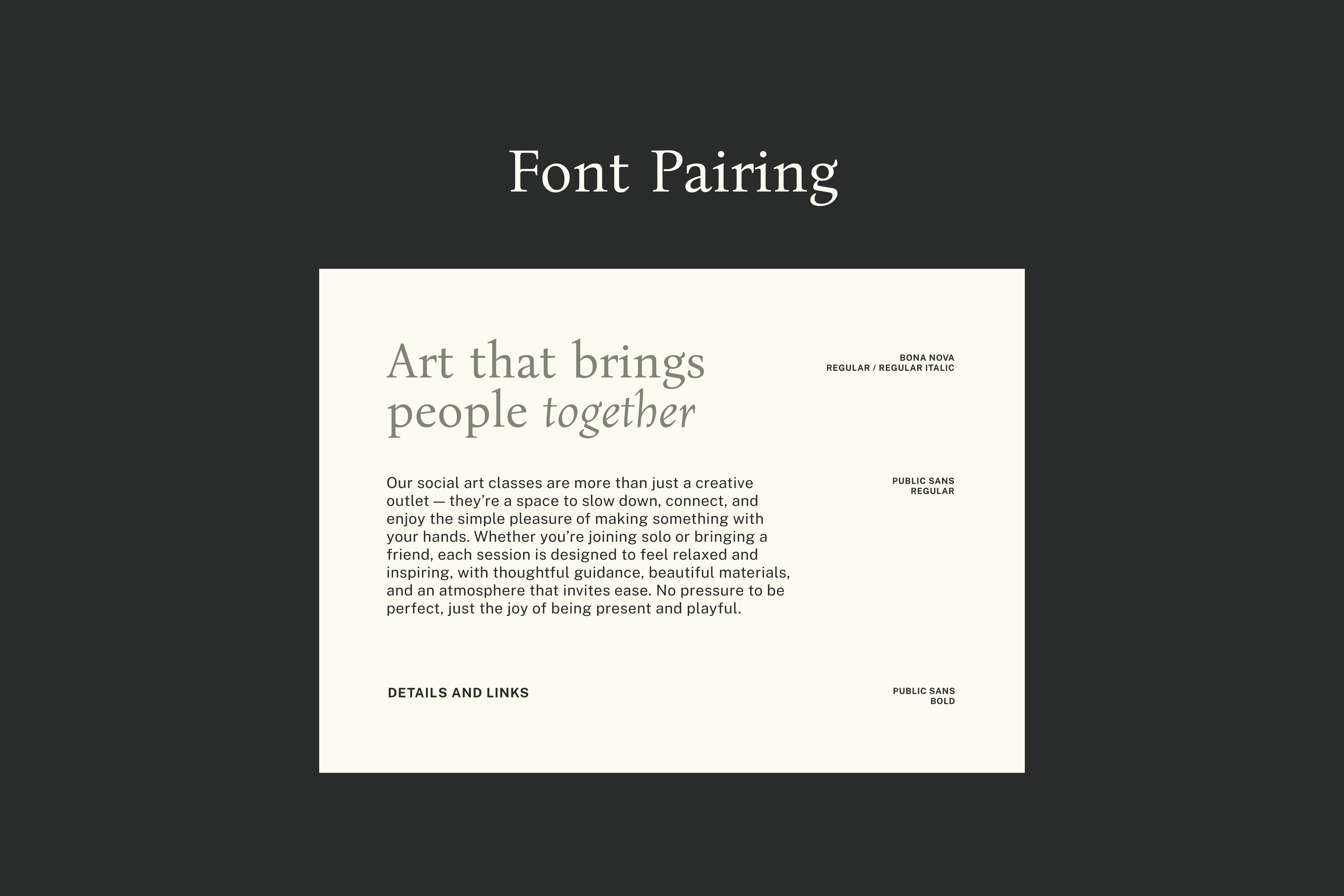
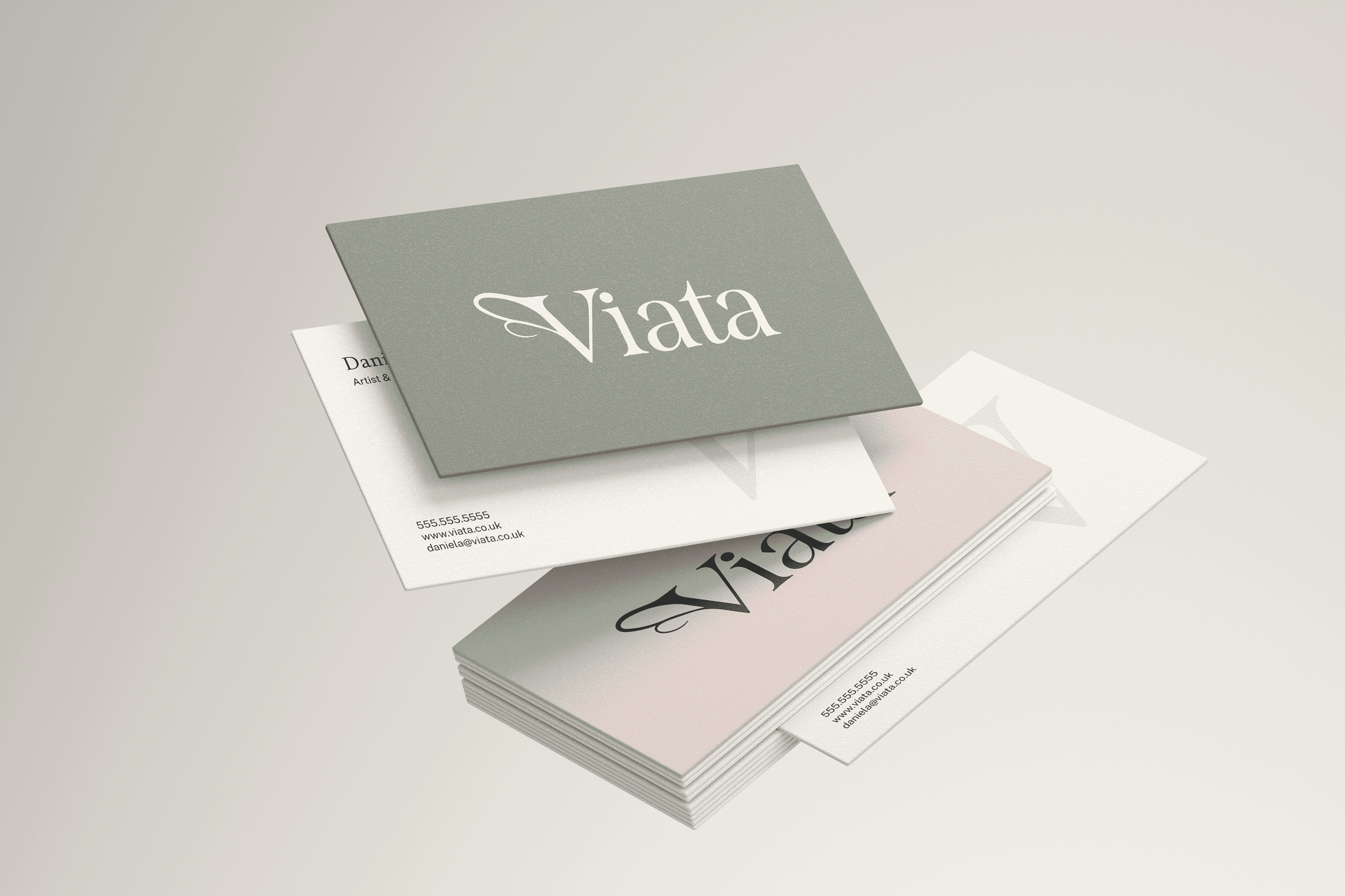
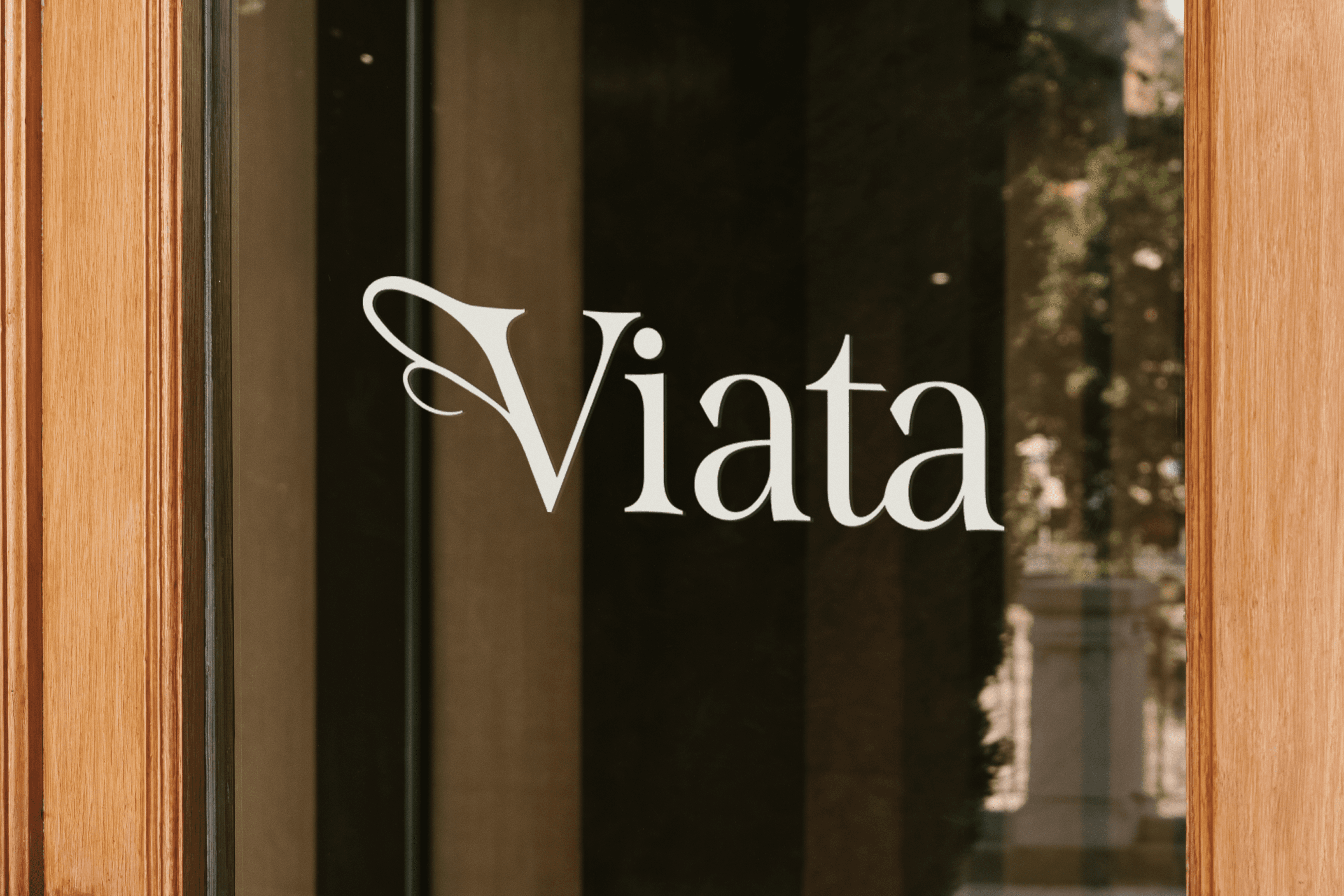
During our conversation, Daniela mentioned she likes bees. A quick Google search would tell you that "across cultures, the bee symbolizes community, teamwork, and the sweetness of life." Paired with her UK setting and the spirit of her classes, the creative direction became a tea break in the garden. The V in the logo is an abstract reference to a bee's wing, the color palette blends cream, blush, and sage green, and the typography carries botanical touches that feel timeless and artisanal.
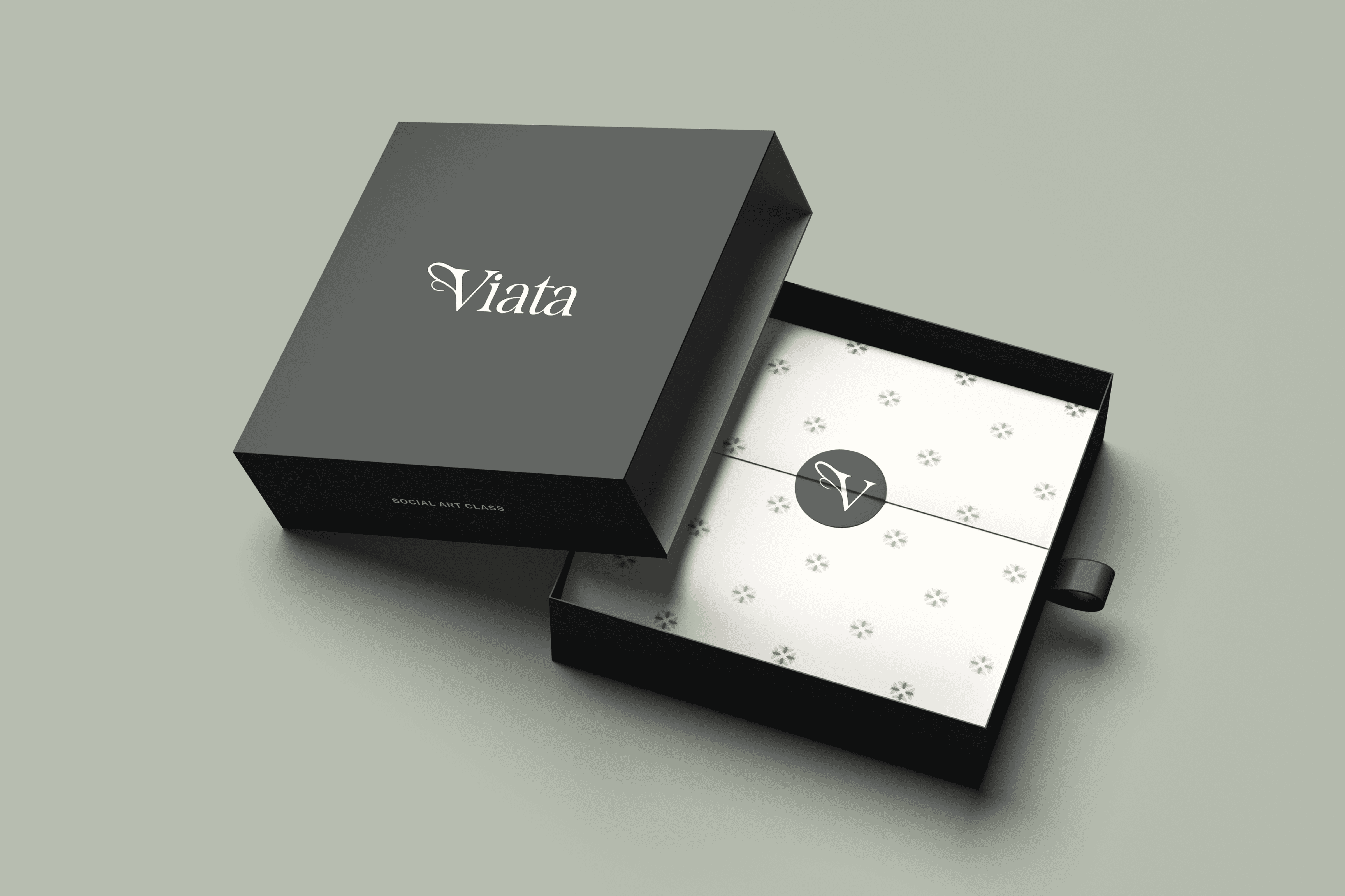


Viata now has a brand that feels as intentional and welcoming as the classes Daniela creates.
The new brand makes new and returning students feel at ease before they even walk through the door.